


Does Black and White Photography Still Matter
Black and white photography is more than just a creative technique or a mode of expression; it’s a medium that has inspired generations of photographers. Although colour photography has been around since the mid-20th century, black and white, even in the digital era, still has the power to capture our imagination. So why does it continue to matter in a world filled with vibrant colours?
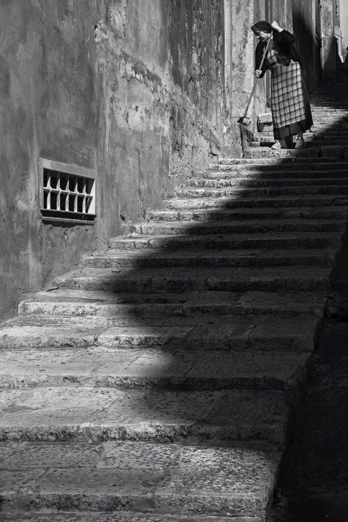
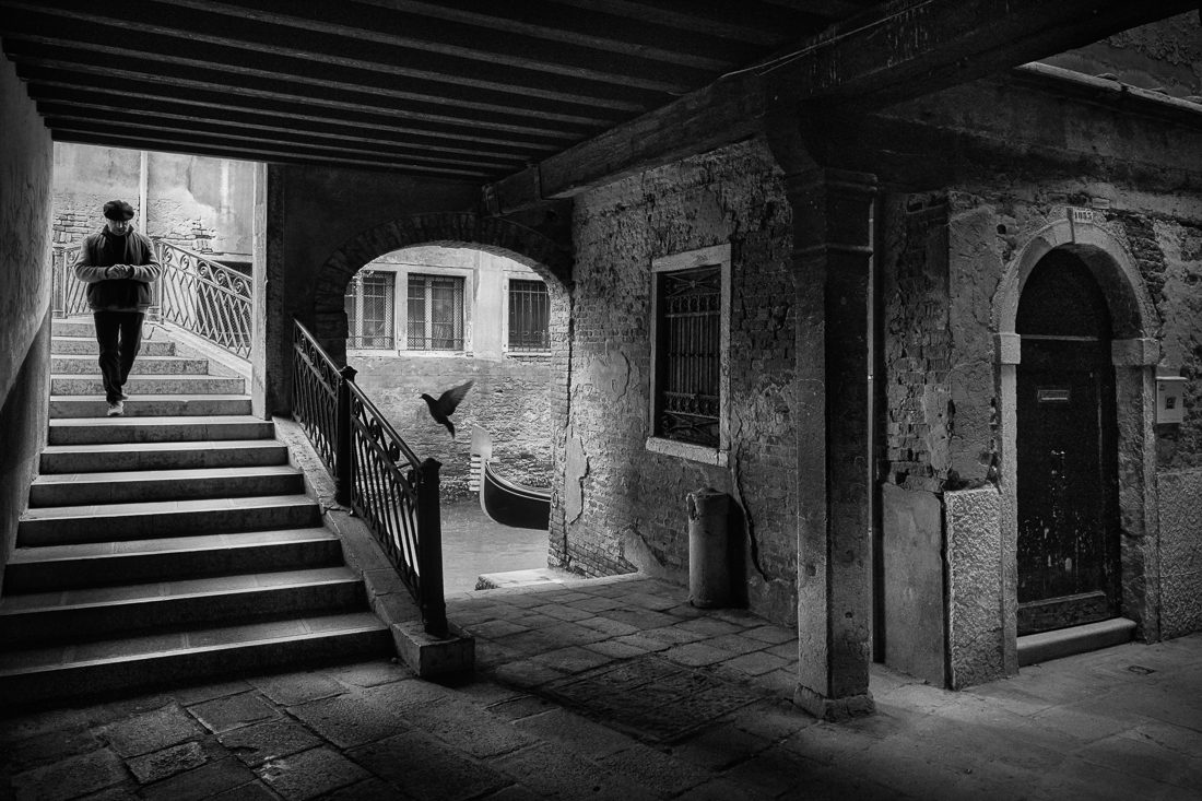
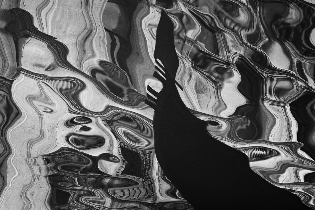
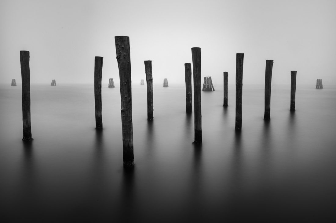
This medium possesses a captivating aesthetic quality that can enchant a viewer. Replacing colour tones and hues with shades of grey focuses our attention towards often overlooked elements. We are compelled to decipher an image through form, textures, tonal contrast, and composition, enhancing our ability to uncover beauty in the ordinary and mundane. Ultimately, black and white photography offers a distinct and alternative perspective to both the photographer and the viewer.
Although I also work in colour, for me, the monochrome image holds an allure. It evokes a sense of drama by intensifying mood and atmosphere, allowing me to disconnect from reality and look at a scene in a more abstract way.
Colour vs. Black and White – A Photographer’s Viewpoint
When it comes to photography, choosing between colour and black and white is a decision every photographer faces. Each medium has its own unique qualities and can evoke different emotions in the viewer, and understanding the strengths and weaknesses of both colour and black-and-white mediums is crucial. It allows us to make deliberate choices and create images that best convey our personal artistic message. Whether you choose to embrace the actuality of colour or the grey-scale beauty of black and white, each technique offers its own creative possibilities. Pitting colour against black and white is pointless as they are different mediums, and understanding the difference is far more beneficial than point scoring.
Recently, I stumbled upon a quote attributed to John Berger that reminded me of the power of painting and photography as visual evidence of how people saw the world. Before the 1930s, when colour film became popular, photography was limited to monochrome. This forced the early pioneers and practitioners to develop a monochromatic eye in order to capture the world around them, and developing a way of seeing in black and white is crucial to the success of using this medium.
In a nutshell, colour photography captures the world as we see it, showcasing the vibrant hues and tones that exist in reality. It creates vivid and realistic images, immediately impacting the viewer. It can evoke specific emotions associated with different colours and add a dynamic and energetic feel to the picture. On the flip side, black-and-white photography removes colour; it highlights the interplay of light and shadow, shapes, lines, and forms, offering a different perspective of the world.
In essence, the comparison between colour and monochrome photography isn’t about superiority; it’s about understanding and appreciating the distinct aesthetics of each medium. A photograph that works in colour will not always translate into a good black and white image and vice versa. Recognising this will lead to a more deliberate and impactful photographic process and is a reflection of the photographer’s artistic voice. Each medium has its own visual language, and as photographers, we need to be intentional in our choice of medium, considering not only what will look aesthetically pleasing but also what will convey the intended photographic message.
Creating Depth and Dimension – Light and Shadow
Photography goes beyond capturing beautiful images; it involves considering more than just aesthetics when deciding between colour and black and white. Black and white photography requires a different approach to light, contrast, composition, and camera technique. Mastering the art of perceiving and capturing this language of contrast and gradations is crucial for creating impactful monochrome imagery.
Seeing in Black and White
I intended to close this post with a short paragraph about my workflow; however, on second thoughts, I thought I might touch upon a point I made earlier in this post, as I feel it is more relevant than simply talking about Lightroom/Photoshop processes, which I can leave for another day.
The way our brains perceive and process black and white images differs from how we perceive colour pictures. This difference has a significant impact on our emotional and cognitive responses. Black and white photography simplifies the visual field by removing colour, allowing us to focus on elements like texture, composition, light, and shadow. This simplification creates a distilled version of reality that emphasises the essence of the subject. The absence of colour often leads to deeper emotional processing, as black and white visuals tend to appear more serious, profound, or somber. This may be due to cultural associations with black and white imagery, like historical footage, or because they leave more room for personal interpretation and emotional projection.
On the other hand, colour photography affects us differently by using hues and saturation to provide direct emotional cues. Different colours elicit distinct responses, such as blue inducing calm, red signalling danger or passion, and green suggesting tranquillity. Our brains respond to colour quickly, making these images more relatable and reflecting our everyday visual experiences. Additionally, colour helps with memory and recognition, as we tend to remember colourful images more vividly than black and white ones, likely because of how colour interacts with our memory systems.
Black and white images are inherently more abstract than colour images, requiring a different kind of engagement from the viewer. This abstraction creates space for interpretation and allows viewers to project their own emotions and stories onto the image, leading to a more personal and profound connection. Furthermore, black and white photography carries cultural and historical connotations, evoking feelings of nostalgia or timelessness and prompting a more introspective viewing experience.
Understanding the psychological impact of black and white versus colour images is essential for both photographers and viewers. It informs the creative process, influences perception, and shapes the connection with photographic art. While colour provides immediate and direct emotional cues, black and white photography offers a more subtle, interpretive, and potentially profound emotional experience. Recognising these unique psychological impacts empowers photographers to choose their medium intentionally, using the expressive languages of colour and monochrome to convey their artistic messages and visions effectively.
Final Thoughts
The choice between colour and black and white in photography is not merely an aesthetic one; it carries significant psychological implications as well. It’s a powerful tool that photographers can utilise to enhance their narrative and invoke emotions in their audience. Whether it’s the immediate, relatable response evoked by colour or the abstract, introspective engagement elicited by black and white – each has its own artistic merit. Understanding these underlying psychological interactions can greatly enrich both the process of creating and viewing the photographic image.